New: the plan comparison tool for LLM subscriptions
DeepFrugal now has a dedicated plan comparison tool. Enter one monthly workload and see which of two subscription plans costs less.
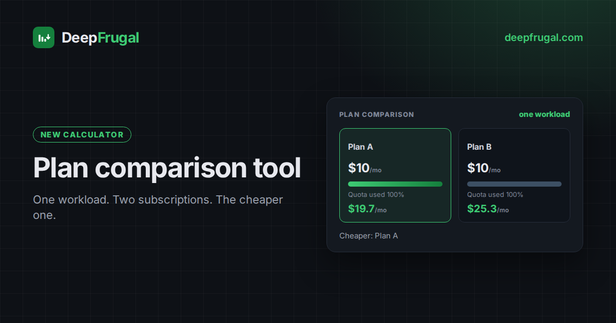
DeepFrugal has a new page: a standalone plan comparison tool. It answers one question — for one monthly workload, which of two subscription plans costs less?
What the tool does
The tool values your monthly usage at the listed rates. It then spends each plan's monthly quota on that usage and bills anything above the quota at those same rates. The result is a head-to-head comparison with a shared cost curve.
One card names the cheaper plan and the monthly gap. Below it, two plan cards show the quota used, what the quota covered, what fell above the quota, the average cost per 1M tokens and the total monthly cost.
How it values the workload
A plan's quota is a monthly budget, not a token count. It is spent at the listed rates, so the same workload consumes more of a plan whose quota per model is smaller — see how AI subscription credits work. The tool reads four token types:
- Input — fresh prompt tokens.
- Cached read — prompt tokens served from cache, usually cheaper.
- Cached write — tokens written into the cache, when the provider charges.
- Output — generated tokens.
It allocates the budget in the order you list your models and marks any usage it cannot cover as pay-as-you-go. Reorder the mix to approximate your own pattern.
Pick the two plans
The page opens empty: no plan and no workload. Pick a plan for Plan A and Plan B from the two lists. Plans are grouped by gateway. Only plans with a computable quota appear, because the tool needs a quota to value usage.
The workload editor appears once both plans are chosen. The workload is the intersection of the two plans: a model you can draw from on both sides. A model on one plan only is not compared.
Read the chart
Plan comparison details draws one average-cost curve per plan as your usage grows. Each curve falls inside the quota, reaches the plan's effective rate at its quota limit and climbs again above it towards the overflow base. The listed rate is a shared horizontal reference and the cheapest pay-as-you-go route is the red line. Open How the graph is calculated for the method.
Read the panels
Open How the quota is allocated for the per-model breakdown. It lists each model's usage, how much of it fell above the model's own quota, and its share of each plan's budget. Under Options, the Overflow billed at pills set how usage above a quota is billed — the listed rate, the cheapest pay-as-you-go rate, or the cheaper of the two — and Promo prices toggles the figures between the current promo and the pre-promo list rates.
Move between the plan tools
The result links across the plan tools. Compare these plans model by model on monthly quota → opens the plan head-to-head, which ignores the workload and asks which plan grants more value per dollar. Open the plan finder on this mix → ranks every plan on the same workload.
Every calculation is shareable
The page writes its state to the URL. Change the plans, the models or the usage, and the address bar follows. Copy the link from the Share button to keep a comparison or send it to someone else.
Articles can link to a preconfigured comparison the same way. A link such as
/tools/plan-comparison/?a=<plan>&b=<plan>&mix=<models> opens the page with both
plans and the workload already set.
The tool is experimental
The tool is marked Experimental. Confirm every figure against the provider's own pricing before you rely on it. Plans, promos and quotas change over time; the tool recomputes on every page load from the same data as the main table.
Next step
Open the plan comparison tool to compare two plans on your own workload. To weigh one plan against pay-as-you-go, open the break-even calculator. Then use the live table to filter plans by provider, context, latency and privacy.
Frequently asked questions
What does the plan comparison tool compare?
Two subscription plans on one monthly workload, model by model.
Which plans can I pick?
Plans that publish a token quota. The picker lists them by gateway.
What does the result show?
The cheaper plan, each plan's quota used, what the quota covers, what falls above it, and the cost curve across your usage.
Can I share a comparison?
Yes. The inputs live in the URL and the Share button copies the link.